Alessandro Caforio di Generazione Elle mi ha intervistato a proposito del Taggatore. Si parla di Web, di libertà d’informazione. Quantomeno imbarazzante.
World Wide Web
Magazine Roma
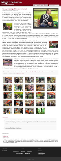
So here’s my latest project: Magazine Roma, a website about Rome. Images, sounds and words to document the city I live in. I created the site together with three friends and colleagues: Fabrizio, Federico and Antonio. The site is available both in Italian and English.
Magazine Roma is rather blog-like but has some interesting features.
- A (Google) map showing georeferenced posts, so you can spatially explore the city. We’re still defining the polygons to represent rome areas. You can use them to find all posts related to a specific area. We also have a KML to use with Google Earth.
- A nifty flash-based slideshow with sound powered by Soundslides.
- Photos are also accessible without a flash plugin. We use a (heavily modified) Lightbox script which gives you the image perfectly sized for you screen.
- The search box features useful (and cool) suggestions based on the available tags.
Well… that’s enough marketing-speak — Hope you like it.
Kataweb News
My latest effort in web development is now online, its name is Kataweb News. It’s an italian news aggregator. Incoming news content from the main italian media is analyzed and keywords (Web 2.0 fanboys would say tags) are automatically extracted. Other features include user comments, a usable and standard-compliant design, so called tag clouds and contextualized RSS feeds.
Another main feature is decontextualized advertising (also known as spam), but Adblock can help with this kind of features.
Obviously the site makes heavy use of Gomba, Juseppe, the patched JSTL and the HTTP Headers Filter.
This is mainly a one-man project starting from the MySQL schema, to the application logic, up to the CSS style. I hope the site will be useful to real people and that it brings innovation to the italian web, which is rather depressing these days.
UPDATE: Here’s a list of reviews and comments about the site:
Multimedia and usability on the Web
Multimedia content on the Web is plagued by usability problems. I created this simple prototype for the company I work for, trying to demonstrate that browser plugins are not the way to go. The most seamless user experience is not the embedded (Windows) media player.
Let people choose or at least let the OS choose. Many users are able to configure a browser in order to use their favorite player. Operating systems provide carefully chosen defaults for the majority of people who are unable to tweak their system, a website can’t do better than that.
There’s no pragmatical or economical explanation for the crippled presentation of multimedia content, it’s just due to plain ignorance. Marketing people are scared of letting people directly access the streams because of advertising. Many had the brilliant idea to put banners aside the embedded player. Ads can be served much more nicely in the stream without even recurring to client-side scripting: ASX e RAM files are basically playlists, just put the ad in there. Then again this is almost always a problem due to the very advertising systems that were supposed to ease the work of marketers.
UPDATE: the prototype eventually became a real site called Kataweb Multimedia. Obviously the marketing people forced us to drop the use-your-own-player approach. Nevertheless I’m really happy since this is the first Kataweb site and probably the first site in any italian portal that validates. Wow! I’m turning into a web designer.
